Mendora is an AI-powered personal health app — daily wellness tracking, an AI symptom checker, and guided rehabilitation advice in one place. The work: a brand and product that feel like a companion, not a diagnosis machine.
Live project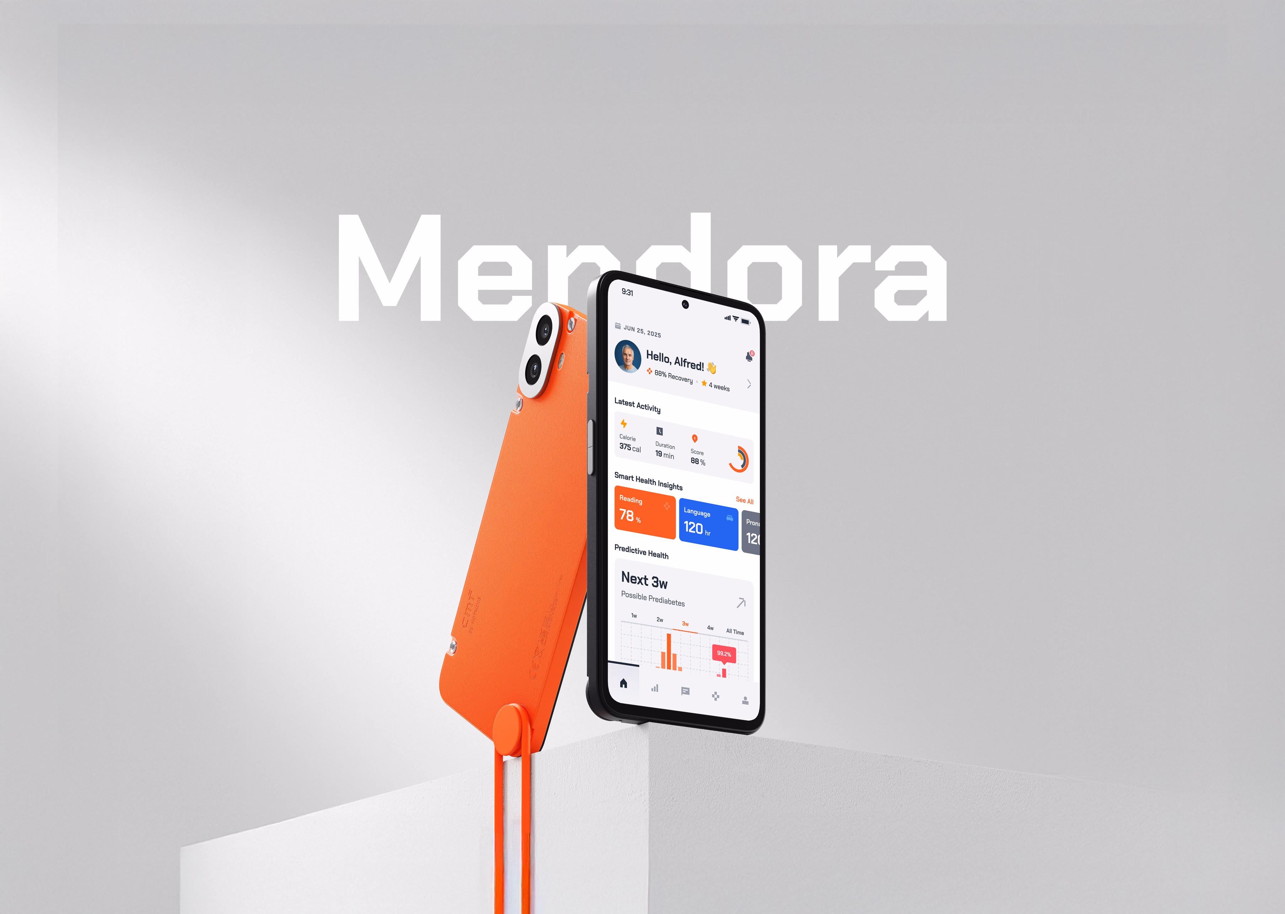
The
problem.

Mendora’s old marketing leaned on a stock photo of a doctor and a promise to “save lives.” For an app people turn to about their own body, that read as generic and a little cold.
The product itself — a symptom checker plus ongoing health tracking — was genuinely useful. But the brand around it oversold and under-connected. It didn’t feel like something you’d trust with a 2am symptom search.
The results
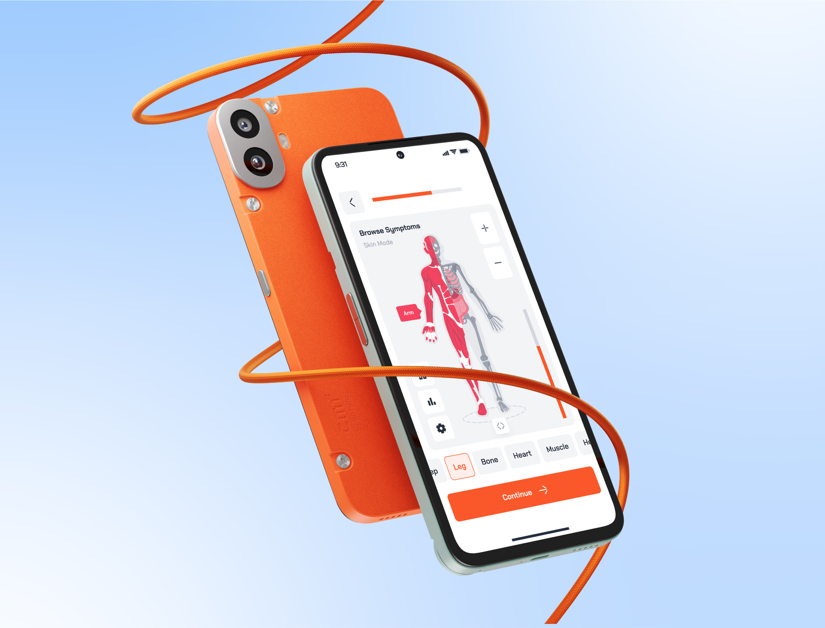
I replaced the stock-photo reassurance with an interface that actually guides — clear steps, plain language, a tone that feels like a knowledgeable friend rather than a clinic waiting room.
The approach
For the identity I aimed for calm and capable — confident enough to be trusted with health data, warm enough that opening the app doesn’t feel clinical.
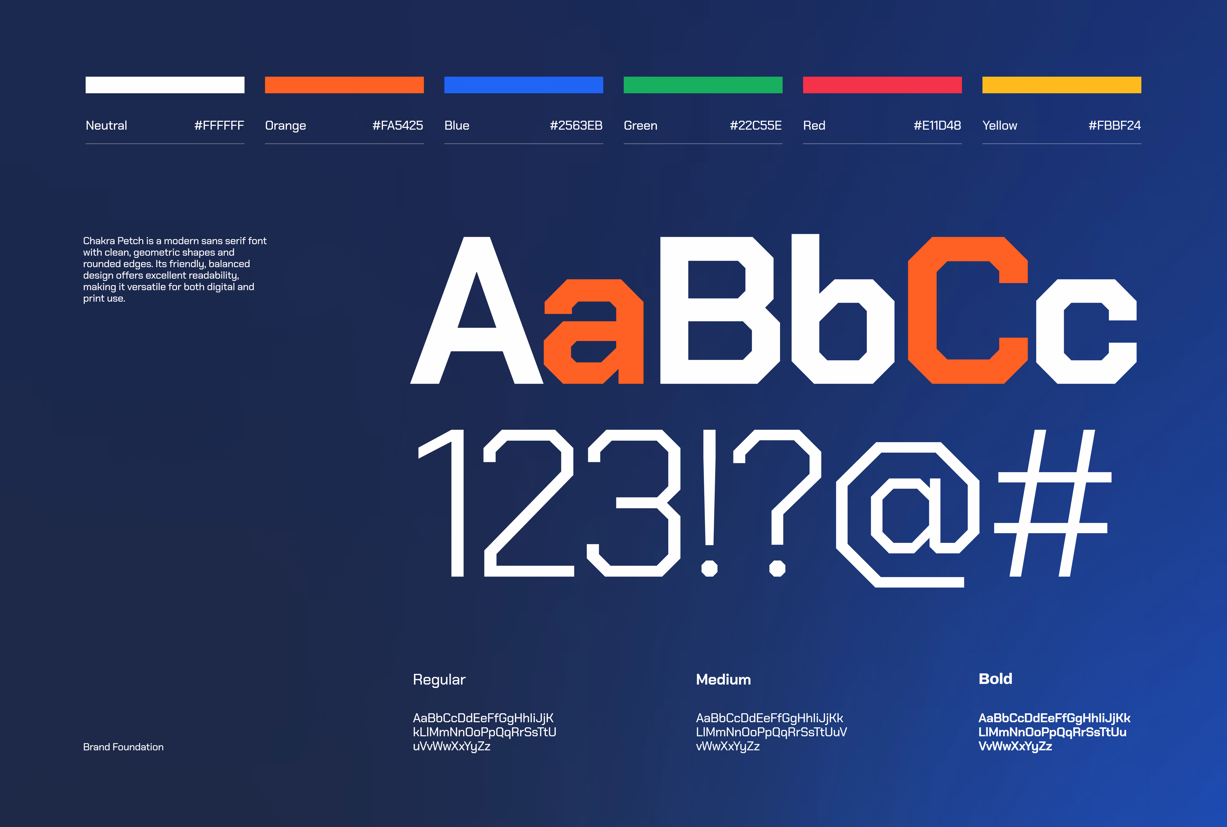
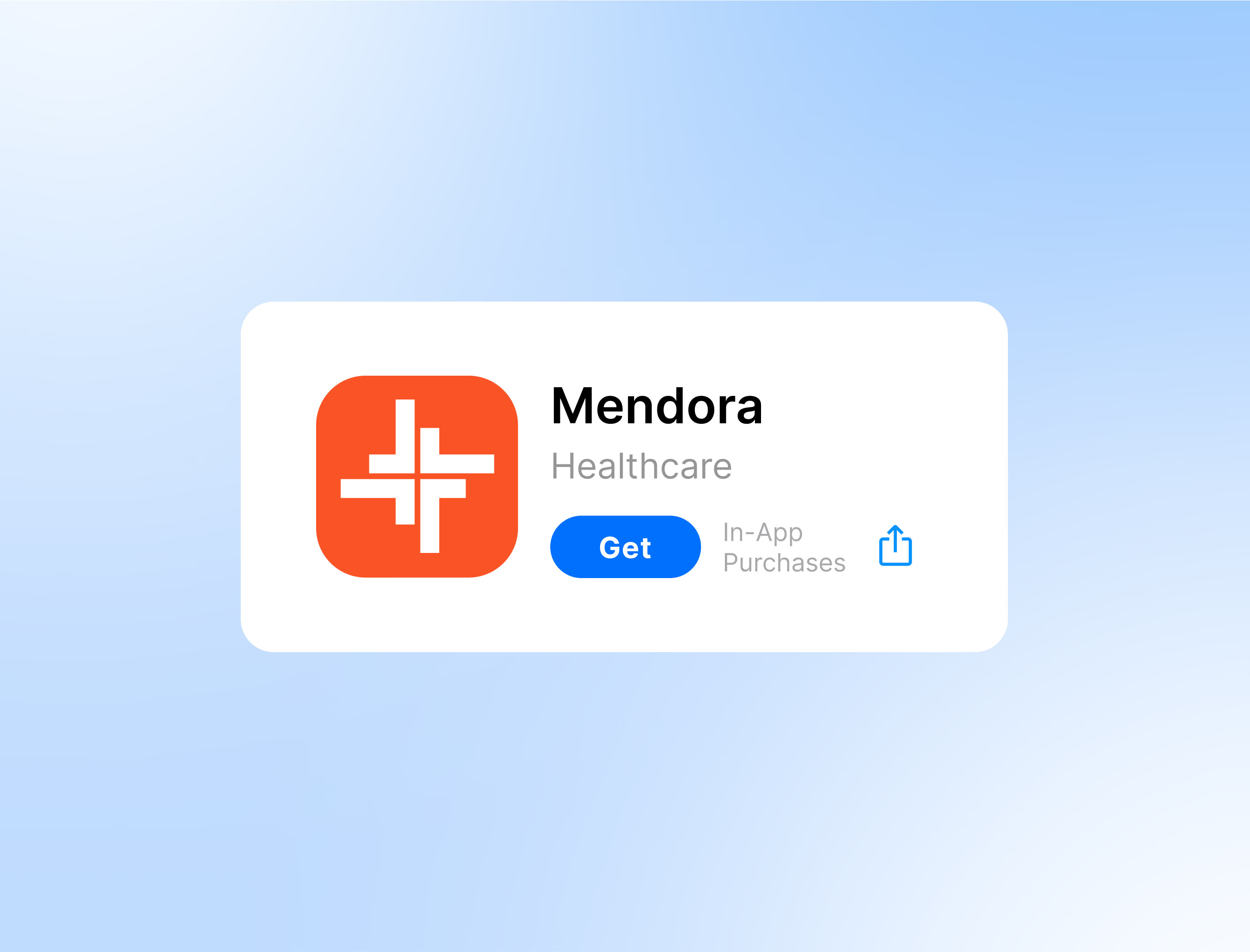
A grounded palette (orange, blue, green, red, yellow against neutral) and clean geometric type give the system structure without feeling sterile. The symptom-checker flow was redesigned step by step — one question at a time, a body map instead of a form — so it guides instead of interrogating. It shipped to the App Store under Healthcare.
Live projectClient
words.

“People are anxious enough when they open a health app. Dima’s redesign made Mendora feel like it was actually on your side — the symptom checker stopped feeling like a form and started feeling like guidance.”
Trust in a health product isn’t a tagline — it’s in whether the next tap feels obvious.